How to Create a Landing Page That Converts in 2025
April 12, 2025
Creating a landing page that actually converts visitors into customers in 2025 is part art, part science—and 100% necessary for any business serious about growth.
Whether you're a solo entrepreneur, SaaS founder, small business owner, or marketer, your landing page often serves as the first real interaction between your brand and your potential customer. It's your one chance to make a strong impression, guide visitors toward action, and ultimately drive revenue.
In today’s competitive digital environment, where the average landing page conversion rate is around 4–5%, the stakes have never been higher. That means most visitors leave without taking action. But by understanding and applying modern landing page best practices, you can outperform the average—and turn your landing page into a conversion powerhouse.
In this detailed guide, you’ll discover how to:
- Create a high-converting landing page step-by-step
- Optimize your page for maximum impact
- Incorporate 2025 SEO strategies
- See real-world examples that you can learn from
- Speed up your workflow using Viveboard’s Content Copilot, an AI assistant designed to help you create better pages faster
Let’s dive in!
Why High-Converting Landing Pages Matter (Especially in 2025)
In 2025, consumers have more choices and higher expectations than ever. Whatever product or service you offer, chances are your visitors have seen multiple alternatives before landing on your page. According to marketing experts, the typical customer is inundated with options and will quickly bounce if your page doesn’t grab their attention and instantly communicate value.
Optimizing your landing pages is also crucial for maximizing the return on your marketing efforts. Whether you’re driving traffic via ads, social media, or search engines, every visitor is hard-won. A well-designed landing page ensures those visitors don’t slip away in a matter of seconds. Even small improvements can mean a big difference—in fact, top-performing landing pages often convert 2–5× higher than average ones.
Great landing pages build trust and credibility, which carry long-term benefits. By showcasing clear value and social proof (like testimonials or client logos), you reassure visitors that they’re making a smart choice. Google’s recent emphasis on experience, expertise, authority, and trustworthiness (E-E-A-T) in content also means pages that demonstrate credibility can indirectly boost your SEO.
Next, we’ll explore exactly how to make a strong landing page.
Key Elements of a High-Converting Landing Page
Not all landing pages are created equal. The ones that convert at high rates tend to follow a set of tried-and-true principles. Let’s break down the key elements and best practices you should focus on when creating or optimizing your landing page. Think of these as building blocks that, when combined, create a persuasive and user-friendly experience for your visitors.
1. Craft a Strong Headline and Clear Value Proposition
Your headline is the very first thing visitors see—and you only have a few seconds to pique their interest. It should be clear and specific. For example, instead of a vague “Welcome to Our Website,” a landing page for an accounting app might say, “Finally, Stress-Free Accounting for Freelancers”. This immediately tells the visitor what they gain (stress-free accounting) and who it’s for (freelancers).
When writing your headline, consider what your ideal customer cares about most. Are they struggling with a problem that you can solve? Do they want to save money, save time, or improve something in their life or business? Address that core pain point or desire right up front.
Keep the headline text concise and easy to understand. Clarity trumps cleverness here. You can certainly use creative, attention-grabbing language, but not at the expense of clarity. Remember, the goal is to make sure the visitor immediately knows what you’re offering and why it’s valuable. Some high-converting pages even use a supporting sub-headline to reinforce the main message or add a brief sentence of context.
2. Focus on One Goal and Clear Call-to-Action (CTA)
One of the golden rules of landing page design is to keep it focused on a single conversion goal. Unlike a homepage or multi-purpose webpage, a landing page should have one primary thing you want the visitor to do—whether it’s signing up for a newsletter, starting a free trial, requesting a quote, or making a purchase. Everything on the page should be oriented toward motivating that action.
Your Call-to-Action (CTA) button is the star of the show. Make it prominent and impossible to miss. Make your CTA text action-oriented. “Start My Free Trial” is much more compelling than “Submit.” Place the CTA button above the fold, and repeat it at logical points down the page, especially after benefit sections and social proof.
3. Use Engaging Visuals (Images or Video)
Great visuals can make a huge difference in whether your landing page captures interest. Humans are visual creatures, and strong imagery or media will draw the eye and can communicate ideas faster than text.
Hero Image or Background: Most landing pages feature a main image or background at the top (often called the “hero” section). This image should be relevant to your offer and reinforce your message. For example, if you’re offering a software product, a screenshot of the dashboard in action can work.
Product Images or Demo: If applicable, include images of your product or service in use. For physical products, high-quality photos from multiple angles or of people using the product help visitors visualize owning it.
Video Content: A short explainer or testimonial video can boost engagement. In fact, embedding videos on landing pages can lead to an 86% increase in conversions on average. Videos are powerful because they can pack a lot of information into a digestible format and often keep visitors on the page longer. If you use a video, make sure it’s concise (typically 2 minutes or less) and has captions/text overlay (for those watching without sound).
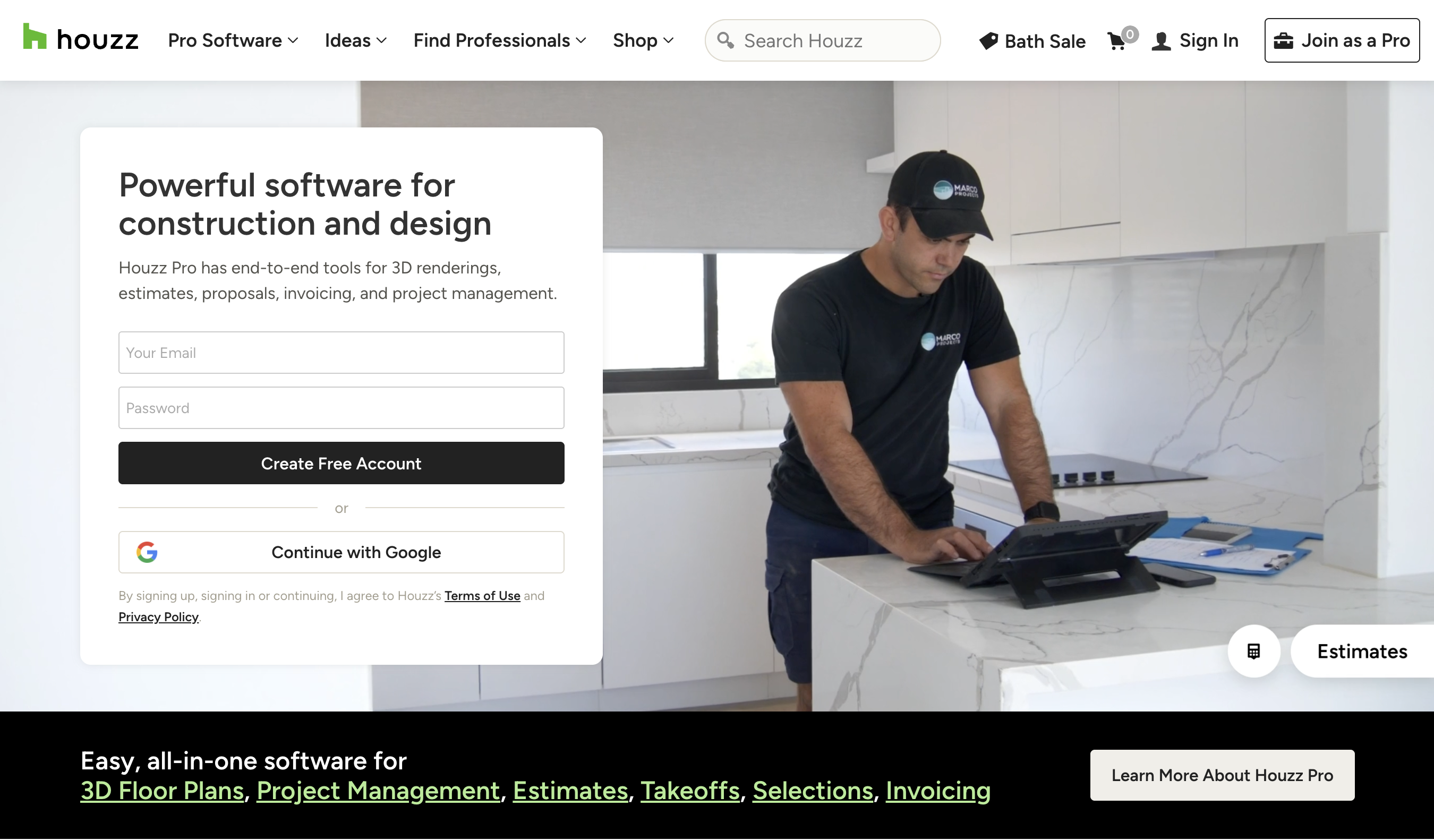
Houzz's landing page has a video which shows the different things that someone who is in the home construction or renovation industry may be doing, which helps connect to the visitor in a visually appealing way.
Always optimize images and videos for fast loading. Large, uncompressed media files can slow down your page, which frustrates users and hurts conversions. In 2025, users expect pages to load almost instantly; if your landing page takes too long, visitors may bounce before they even see it.
4. Highlight Benefits Over Features
People don’t care about features—they care about outcomes. Every feature listed should connect to a clear benefit.
For example, imagine you offer an email marketing tool. A feature is “it has automated segmentation.” The benefit of that feature is “save hours by automatically grouping your subscribers for targeted campaigns.” On your landing page, you would highlight the latter—how it saves time and improves results—since that resonates more with what the user cares about. Every feature you mention should be tied to a clear benefit.
Structurally, you might present benefits in a bullet list or a series of short sections with icons. Keep the text scannable; many visitors will skim before they commit to reading in detail. Using subheadings or bold text for the benefit (e.g., “Save Time with Automation”) and then a brief explanation can work well.
5. Add Social Proof and Trust Signals
When a visitor lands on your page, they’re likely asking themselves, “Can I trust this? Is this legit?” Including social proof and trust elements can powerfully answer those questions and reduce anxiety about taking the next step. In fact, testimonials are featured in 36% of top-performing landing pages.
Build credibility using:
Testimonials: If you have happy customers or users, ask them for a brief testimonial about how your product/service helped them. Featuring a couple of authentic quotes (ideally with a name, photo, and/or company for credibility) can reassure visitors that real people had a positive experience.
Case Studies: If applicable, cite specific results or metrics. E.g., “Over 10,000 entrepreneurs use this app,” or “Helped businesses save 20% on costs in the first year.” Quantifiable results act as proof that your claims aren’t just empty promises.
Client Logos: Another common practice is showing logos of well-known clients or partners if you have them. A simple “Trusted by” section with a row of logos can lend instant credibility, especially if the logos are recognizable brands in your industry.
Awards or Certifications: Have you won an industry award, or are you certified by a reputable organization? Showcase those badges. For example, “Google Partner” certification, BBB accreditation, or security badges (for ecommerce, a “Secure Checkout” seal or SSL icon) can alleviate fear.
Privacy Policies: If your business has been featured in press or media (“As seen in Forbes, TechCrunch…”), a small section or line can highlight that.
All these elements reinforce trustworthiness. They answer the visitor’s doubts by essentially saying, “Others have tried this and it worked for them” or “Authoritative sources vouch for us.” This is crucial if you want the visitor to feel comfortable converting, especially for higher-stakes offers like buying an expensive product or signing up for a service contract.
6. Keep the Page Simple and Fast-Loading
“Simplicity” is a recurring theme in high-converting landing pages. A clean, uncluttered design helps your message shine and prevents overwhelming the visitor.
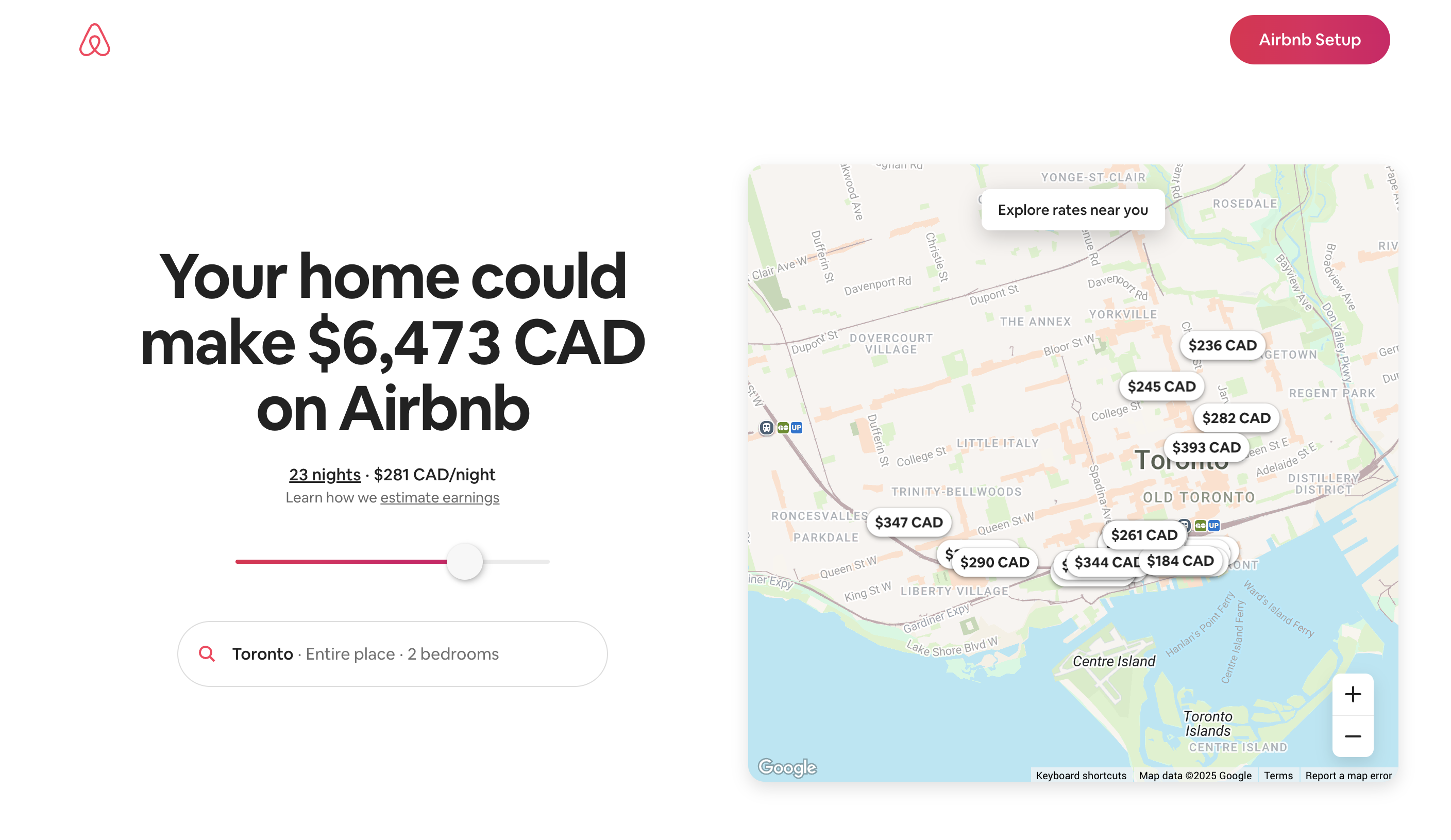
Airbnb’s landing page for new hosts is lauded for its simplicity and clarity. It presents one primary message and action without a lot of clutter. The page features multiple credibility elements to make people comfortable with the company, yet it remains easy to navigate and has an obvious, brightly colored CTA button that stands out.
Also, be mindful of your page speed. In 2025, users expect pages to load lightning fast, and search engines like Google use site speed as a ranking factor. A slow landing page can kill conversions—visitors might abandon the page before they even see your offer.
A related point is mobile optimization. We can’t emphasize this enough: make sure your landing page is mobile-friendly and responsive. More than half of web traffic is on mobile devices, and in fact around 63% of consumers primarily use mobile to learn about products and services.
7. Stand Out with a Unique Angle or Story
We’ve covered the foundational elements (headline, CTA, visuals, etc.), but there’s another layer to consider: standing out against competing products. Chances are, your visitors have seen other solutions similar to yours. How can you make yours memorable? One approach is to infuse a bit of storytelling or a unique angle into your landing page.
Consider leading with a brief story or scenario that your target customer can relate to. Storytelling is hardwired into human brains; it’s engaging and can make your message more relatable. For example, you might open your landing page copy with a few lines like, “Meet Jane. She’s a small business owner who spent more time juggling spreadsheets than growing her business—until she found [Your Solution].” By setting up a common pain point as a mini story, you show the visitor you understand their situation.
Another way to stand out is by explicitly addressing why you’re different from the competition. You could have a section or a statement that says, essentially, “Why choose us over X or Y?” Do you offer a feature they don’t? Do you cater specifically to a niche audience with specialized needs? Highlight that.
You should also reflect your brand’s personality. If your brand is fun and quirky, let that shine in the copy or visuals (as long as the tone fits your audience). If you’re all about professionalism and expertise, a more authoritative tone with data points might resonate. Being authentic in your style helps differentiate you because no two brands have the exact same voice or vibe.
8. Include an FAQ or Additional Info (If Needed)
Answering common objections before visitors even ask them can drastically increase conversions. Addressing these questions proactively serves two purposes: it reassures the visitor (removing last bits of doubt) and it also has SEO benefits.
if your landing page is the long-form type (common for more expensive or involved offerings, like a coaching program or an enterprise software), you might naturally include multiple sections of information. In such cases, structure the page in a logical flow: problem -> solution -> features/benefits -> social proof -> pricing or next steps. Long landing pages can work very well for educating and converting warm prospects, but make sure to break up text with headings, images, and callouts so it’s easy to follow.
One thing to remember: there’s no single “perfect length” for a landing page. The ideal length is “as long as necessary, but no longer.” If you can communicate the essentials and persuade someone in just one screen’s worth of content, do that. If you need to provide more detail and proof, go ahead and make it longer—just ensure every section is valuable and engaging.
9. Test and Tweak for Continuous Improvement
No matter how well you follow best practices, the first version of your landing page is rarely the best version. A/B testing (or split testing) is a powerful technique where you make one change at a time and see if it improves conversions. For example, you might test two different headlines, two images, or two CTA button colors to see which version gets more sign-ups. Over time, iterative testing can significantly boost your conversion rate.
However, be strategic in what you test. Test big, impactful elements first (like headline or offer wording) rather than tiny details. According to one study, only 1 out of 8 landing page A/B tests produces a significant change – sometimes differences are just noise. So, focus on bold changes that could yield larger differences. If you’re not getting at least a few hundred visitors to your page, don’t overdo it with testing; you need a decent sample size for results to be trustworthy.
Using AI to Streamline Your Landing Page Creation
By now, it’s clear that crafting a great landing page involves juggling a lot of elements: compelling copy, good design, SEO considerations, and continuous optimization. If that sounds like a lot of work, you’re not wrong! The good news is, you don’t have to do it all manually. AI-powered tools have advanced significantly by 2025 and can give you a serious productivity (and creativity) boost when creating landing pages.
One such tool is Viveboard’s Content Copilot (an AI content generator) which can assist you in building optimized landing page content quickly. The idea isn’t to have AI replace your voice or strategy, but to use it as a capable assistant that can save you time and spark ideas.
Here’s how it helps:
Generates Multiple Content Versions: Staring at a blank page is tough. Content Copilot can produce several variations of headlines, subheadings, or body text for your landing page at the click of a button.
Built-in Keyword Optimization: You can input the keywords you’re targeting, and Content Copilot will aim to include them in a natural way. This ensures that the copy it creates isn’t just persuasive to readers, but also aligned with the terms that search engines (and thus searchers) are looking for.
Customizable Style: Worried that AI might generate something off-base? Quality AI tools let you give custom instructions or style guidelines. For instance, you can instruct Content Copilot to “write in a friendly, casual tone” or “emphasize how our app saves time and money in each paragraph.” You remain in control of the direction.
Unblocks Writer’s Block: Sometimes you know what you want to say but the words just won’t come. Or maybe you need to create 5 different landing pages for different buyer personas and you’re running out of creative juice by page 3. AI tools can keep the ideas flowing. It doesn’t get tired, and it can surprise you with angles you hadn’t thought of.
Rather than replacing your creativity, Viveboard’s Content Copilot amplifies it—helping you produce better landing pages in less time, while keeping everything aligned with your brand voice.
In 2025, top-performing marketers are the ones who leverage AI to work smarter, not harder—and Viveboard makes it simple.
Armed with these insights, go ahead and build or refine that landing page. Whether it’s for your startup’s new feature, your client’s campaign, or your own small business, you now have the roadmap to make it effective. In 2025, you have more tools and knowledge than ever to create landing pages that not only attract visitors, but turn them into loyal customers. Good luck, and happy converting!